As you might know, Google is rolling out mobile-first indexing as we speak. In September 2020, all websites will be ported over to the mobile-first index. But what does that mean for your ranking? Should you be worried? Should you do anything? Google has been pretty vocal on mobile-first indexing. This post serves as a reminder so, I’ll talk you through five things you need to know about mobile-first indexing.
Mobile-first indexing
In March 2018, Google announced that they were going to start with mobile-first indexing. In March 2020, Google announced that it would roll out mobile-first indexing for the whole web. This will happen in September 2020. But what does that entail? It means that from now on, Google will base what it places in the index on the mobile version of your site, whereas they used to index the desktop version of your site first.
Update July 21, 2020: Google just announced that the launch date of the mobile-first index moved from September 2020 to March 2021. Google also shared additional tips to get ready. Read the announcement on Google’s Webmaster Central blog.
This switch is made because more and more searches come from a mobile device and to give those users a better experience, Google decided that it was time to prioritize mobile results. It is important to note that the mobile-first index is not a separate index, Google has only one index from which it serves the results.
From September, the mobile version of every site will be indexed. But that does not mean that anything big is happening. In fact, it probably doesn’t do anything to your rankings. If Google indexes the mobile version of your site, you’ll get a notice in your Google Search Console. This means that Google will determine by the content available on your mobile site how you will rank — both on the desktop as well as on mobile. This sounds pretty big, but for most WordPress sites it’ll have minimal consequences. If you think about it, most WordPress sites have a responsive design. This means that both mobile and desktop display the same content. You’ll have nothing to worry about in this case.
If you have different websites for mobile and desktop and your mobile website has far less content – you do have something to worry about.Everything you are offering on your desktop site should be available on your mobile site — this is called mobile parity. This also includes your structured data and any meta data like titles, descriptions and robots meta tags.
If you’re looking to also improve the speed of your site and the user experience, it might be good to look into the upcoming page experience update by Google as well. Mobile-friendliness is one of the signals that informs the page experience algorithm.
2. Do a mobile-friendliness test
You do not have to have a mobile site to be in the mobile-first index, as Google will index desktop sites as well. But, it’s going to be harder to rank if your site is not mobile-friendly. So there’s work to do for all of you who have not have a mobile-friendly site yet.
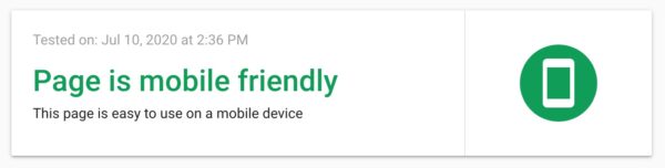
Check how Google sees your mobile page
So what do you need to do? Check out Google’s mobile-friendliness test and check whether or not your site is mobile friendly. In our experience, this is a minimum requirement. If your site does not pass this test, your mobile version is not up to scratch. Read our Mobile SEO ultimate guide to learn how to improve your mobile site. Also, be sure to read Google’s documentation on how to get your site ready for mobile-first indexing.
3. Think about UX on mobile
A mobile website needs a different design than a desktop version to appeal to your audience. Your screen is tiny. While it might make sense to discard a lot of content on mobile due to space limitations, that wouldn’t be a good practice.
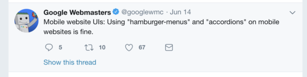
Of course, you can improve the mobile user experience by following best practices. For instance, Google explained that hamburger or accordion menus are perfectly fine to use. These kinds of menus make sense; they help a mobile user to browse through your website. Putting content behind a tab to make the mobile experience better is also totally fine.
Reading from a screen is hard. And reading from a mobile screen is even harder than reading from a big screen. To attract a mobile audience, you’ll need to have mobile-friendly copy. This means short sentences and compact paragraphs. You need to make sure your font on your mobile site is large and clear enough, and you need to make sure to use enough whitespaces.
Is your audience mainly mobile? Do they come from the mobile search results to your page? Or does most of your organic traffic come from the desktop SERPs? Make sure to check this in your Google Analytics.
If your search traffic is mostly from mobile search result pages, make sure to optimize your mobile snippet in our Google preview.
Check your mobile snippets in the Yoast SEO Google preview
Conclusion on mobile-first indexing
Don’t panic about the mobile-first index Google will fully roll out in September 2020. If your website has a responsive design, your content will be similar on both desktop and mobile versions. Please check if that’s the case. If so, the mobile-first indexing will have little consequences for your ranking.
Do take some time to evaluate the mobile version of your website. Is your design good enough? Or could you improve? Are the buttons large enough to tap? What about your content? Could you make your text more readable for a mobile audience? Making sure your website has a kick-ass mobile experience is something you need to get started on. This will make a difference in your rankings shortly.
Marieke was Head of Strategy and former CEO at Yoast. During her time at our company she wrote a lot. Topics that she loves writing about include SEO copywriting, site structure and readability.
June 13 - 15, 2024
Team Yoast is at Attending, Organizing, Sponsoring, Volunteering WordCamp Europe 2024! Click through to see who will be there, what we will do, and more!
See where you can find us next »
23 May 2024
Learn how to start your SEO journey the right way with our free webinar. Get practical tips and answers to all your questions in the live Q&A!
All Yoast SEO webinars »
15 Responses to 5 things you need to know about mobile-first indexing
Sea&Lake Luksusowe Apartamenty Mielno • 4 years ago
Does responsive layout is equal mobile first website?
Jack • 4 years ago
Thank you so much for the reminder. We recently started focusing more for mobile friendly website as we are started getting more and more searches from mobile nowadays.
Camille Cunningham • 4 years ago
You’re welcome, Jack. Sounds like you’re on the right track, so keep it up!
dollarsbull • 4 years ago
I was not aware of this news. Thanks for sharing this information about google mobile-first indexing. Really appreciated.
Camille Cunningham • 4 years ago
You’re welcome :)
Yash • 4 years ago
Very informative stuff although my website is mobile friendly.
Camille Cunningham • 4 years ago
That’s great, keep up the good work!
Keerthi Bandara • 4 years ago
I am developing my site these days as mobile friendly. Thanks for the great info. Yoast always best!
Willemien Hallebeek • 4 years ago
Hi Keerthi, that’s a smart thing to do. Good luck with your site!
Vinod Jose • 4 years ago
Thanks a million for your post. I just figured out that a site of mine had text too small to read and viewport not set errors.
Willemien Hallebeek • 4 years ago
Hi Vinod, you’ve checked this right away, excellent! Now you know and you can fix it. Good luck!
Ivaylo Angelov • 4 years ago
Awesome article! Google are doing a lot of changes recently to prioritize sites that are optimized for mobile devices and your tips how to make our sites better for users with smaller screens are really helpful.
Edwin Toonen • 4 years ago
Great to hear, Ivaylo!
Oliver Levi • 4 years ago
hey yoast, thanks for this great clarification, when i first saw this i had worries but with your articles, i better understand everything now. i believe my site is pretty much mobile friendly but i will double check.
Edwin Toonen • 4 years ago
Hi Oliver. We’re glad you’ve found the article helpful!


Does responsive layout is equal mobile first website?
Thank you so much for the reminder. We recently started focusing more for mobile friendly website as we are started getting more and more searches from mobile nowadays.
You’re welcome, Jack. Sounds like you’re on the right track, so keep it up!
I was not aware of this news. Thanks for sharing this information about google mobile-first indexing. Really appreciated.
You’re welcome :)
Very informative stuff although my website is mobile friendly.
That’s great, keep up the good work!
I am developing my site these days as mobile friendly. Thanks for the great info. Yoast always best!
Hi Keerthi, that’s a smart thing to do. Good luck with your site!
Thanks a million for your post. I just figured out that a site of mine had text too small to read and viewport not set errors.
Hi Vinod, you’ve checked this right away, excellent! Now you know and you can fix it. Good luck!
Awesome article! Google are doing a lot of changes recently to prioritize sites that are optimized for mobile devices and your tips how to make our sites better for users with smaller screens are really helpful.
Great to hear, Ivaylo!
hey yoast, thanks for this great clarification, when i first saw this i had worries but with your articles, i better understand everything now. i believe my site is pretty much mobile friendly but i will double check.
Hi Oliver. We’re glad you’ve found the article helpful!